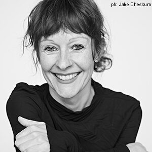
Q&A with Giorgia Lupi
It’s rare to find someone who has truly found their passion in life.
It’s even rarer to find that this person has carved out a wildly successful career around that passion.
And it’s rarer still that the world sits up and takes notice as they brilliantly embody it.

That’s all perhaps why it’s such an utter joy to speak with Giorgia Lupi, who radiates energy as she discusses her career, her craft, her obsession: Data.
Of course, the journey hasn’t all been a straight line for Lupi. The Italian-born designer earned her M.A. in architecture and worked in the field before pursuing her Ph.D. in design, with a focus on information mapping, years later.
“What I’ve learned is to be open to things that you don’t expect,” she says. “You don’t have to have a plan.”
Lupi co-founded the data-driven research and design firm Accurat in 2011, and became a Pentagram partner in 2019 (keynoting HOW Design Live in between). This week, she was awarded the Cooper Hewitt National Design Award in Communication Design—a remarkable career feat.
HOW caught up with Lupi to offer our congratulations, and to explore the path that led to her passion, and beyond.
You grew up in North Central Italy. How did your creativity manifest at an early age?
Like many kids, I was always drawing. The other thing I used to do that comes with creativity and my data obsession is I spent a lot of time at my grandmother’s little tailor shop. She was a seamstress. So I really, really had a lot of fun playing with her ribbons, buttons and things— I would organize and lay them out on the table according to different rules. I would categorize things by color or size. [In retrospect,] I could say that they were histograms or bar charts.
To visually have things organized—I found it creative. And I’m talking in between the ages of 3 and 6 years old.
How did your studies in dance and architecture inform your future in design?
It’s a really interesting question, especially with dance. I started dancing when I was a kid, in ballet. And I think that’s kind of like a sense of discipline of shape—rigor of shapes—because that’s what a lot of ballet is about. You start really seeing your body in space, and so there’s just a spatial awareness that you have. When I was a teenager, and then in my 20s, I did a lot of contemporary dance, which deals with improvisation and/or freeform movements. You’re given a concept and a brief and you run with it, and you move and create in a way that is much more free than following choreography step by step. To me, there is so much improvisation and performance in all the aspects of design, and the more you’re able to master it and make it not like, “Oh, my God, I’m winging it,” but “I’m creating when I’m improvising,” the better. Everything is part of this fluid process. I also think that maybe just aesthetically, being drawn to some particular shapes and combinations and aesthetics and movements from my favorite choreographers at the time informed my sensibility in a way.
In terms of architecture, I’m aging myself, but I started studying it when we didn’t really have computers—well, we did, but it’s not like we were running around with our laptops—and I drew a lot of technical drawings. Thinking about layering and meticulous details that need to be rendered with different hierarchies—because an architect or a constructor needs to read all these architectural drawings—shaped a sense of layers in space.
When’s the first time you can remember consciously being aware of data?
A couple of years ago, my mom was cleaning the basement. She sent me a screenshot of a page of a diary that I used to keep when I was in middle school, and I was apparently charting the boys that I liked [laughs]. There were four boys. There are the names, and then there’s like 30 days, and a ranking from one to 10. And every day, I would just draw a little line, like—Roberto was a nine. Matteo was a four. I don’t think that I was aware of data, but I think I was aware of the power of keeping track of certain facts and metrics, even if they were personal facts.
You’ve said that you came to data as a way to fulfill a new obsession of yours at the time, which was human nature. Tell us a little bit more.
If I didn’t study architecture or didn’t go into dancing, the other thing I was interested in was psychology. I’m still endlessly fascinated by the human mind—what we think, how we’re different, what we struggle with, you know, any aspect. In any data projects that I’ve done, there’s a lot of humanity and human qualities and the human search for things. I think, for me, it’s because it’s the only way that I really feel engaged or interested. And I think that I’ve been learning, through how [my data projects] have been received, that it’s probably also the best way for people to relate—because we relate to things that we can experience as humans rather than just big trends and big data sets, even if they’re really important.
Some of your visualizations are so beautiful—is what we’re seeing in those how you see the world when you look at raw facts and figures?
Let’s say that it’s an aspirational way that I look at them—as in, “oh, something beautiful can come out of this.” It’s not that I already have the vision most of the time when I see a spreadsheet, but I think numbers can produce a lot of beauty. And I like working in structured quantities. Sure, I still like to draw loosely. But it’s so much more interesting for me when I draw with quantitative and qualitative details.
I aim to produce pieces that are beautiful or pleasant—I mean, of course there’s functionality that has to go with it—but I aim for beauty because I think beauty is a very powerful trigger for people to get interested.
You’ve had such remarkable output throughout COVID. And I’m guessing that’s not by accident, given how key data was to our processing of the entire crisis.
I think it was a really interesting moment for information designers. Of course, it was the most terrifying and terrible of moments. But I think at that point, we passed from a population where only a bunch of us cared about data to a population where literally every single person in the world opened up their phones or computers in the morning, and looked for a chart of COVID cases, a map—numbers. The question that I posed to myself was but are we data-literate enough as a general population? Especially with all of the charts that came out of the New York governor’s office and New York State. The numbers were represented well, but I feel that for most of the people that were unable to ask themselves critical questions, the numbers were a little too brutal and too out of context—for example, the number of hospitalizations without understanding how many people were later discharged, how many died. … Again, those numbers were not depicted wrong, because those were the numbers that we had, but a lot of context was missing. So that’s one project that we did with Cuomo’s PowerPoints; we tried to redesign them in a way that could give more context. We also did Happy Data.
It’s not that I had an agenda necessarily, but it felt like a moment where a good visualization project could have a little impact. I would still love for people to be a little bit more data fluent, and to speak data a little better.
What do you feel the future of information design is?
There’ll be more and more data. There will also be more and more people that are able to ask themselves critical questions about it. I would like to think that the future of how we as a population see data will be one where it’s less about simplification and more about having access to complex concepts and complex ideas through it.
And I hope that the critical areas where we will see data—elections, climate change, health care and so on—will be more digestible for people but digestible in a way in which they’ll really understand it.
What do you feel is your best piece of design or career advice?
I got an honorary degree from MICA in May. I needed to deliver a commencement speech to the art and design students. The dean told me to write the commencement speech that I would really have wanted to hear when I was graduating.
In my 20s, after I graduated, I desperately wanted to have it all figured out—to know what I was going to do, that I was going to be that kind of designer, that kind of architect, that at 30 I was going to be here or there … I felt that I needed to have some certainty because I mean, of course, people graduate in a sea of uncertainty. But what I have learned through my 15, 20 years of practicing is that I’m really glad that I didn’t have any plan. Because if I did—and if I wasn’t open to changing my plan—all the opportunities and things that came my way wouldn’t have happened to me. Also, if you already have it all figured out, there’s no fun, there’s no experimentation. So instead of thinking about the void and the blackness ahead of you, think about the possible paths. They’re amazing. There are so many.
Sometimes I think about these people that say, “oh, I want to find my path. I want to find my journey.” All the times that I felt, “I still have to find my path, find my journey,” I was already on it.
For more from Giorgia Lupi, follow her on Instagram and drop by Pentagram and her personal website.
This interview has been condensed and edited for clarity.


